

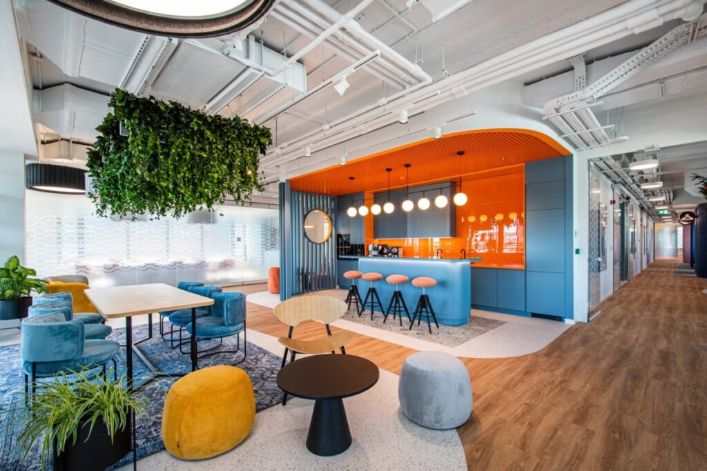
Many studies have been done about how color impacts mood and the impressions that spaces make on people. And yet, too few business owners take these studies into consideration when they’re designing their commercial interior spaces. Carefully choosing the colors of your interior designs can impact not only overall aesthetics, but customer perceptions, employee productivity, and the overall atmosphere in your business. A well-planned commercial interior design uses color to create a strong brand impression while creating an inviting and productive environment.
How Color Influences First Impressions
The colors people see when first entering a business often create an immediate impression. Bright, energetic colors can make a space feel lively and creative, while neutral tones communicate professionalism and sophistication. Warm colors can encourage conversation and activity, while cool colors create a calming and focused environment.
Color helps shape visitor expectations in corporate offices, retail stores, medical practices, hospitality spaces, and other commercial environments before anyone speaks with an employee. The right color palette can reinforce your brand, support the mood of the space, and create the kind of customer or client experience you want people to associate with your business.
Supporting Employee Comfort and Productivity
Color also affects the people who spend the most time in a commercial space, your employees. An office with carefully chosen colors can help reduce visual fatigue, boost concentration, and create a more enjoyable work environment. But different workspaces can actually benefit from different approaches to color use. Collaborative areas can benefit from brighter accent colors to encourage creativity and communication, while private offices and meeting rooms often use softer, more subdued hues for focus and thoughtful discussions. The right balance helps to make a workplace that supports both productivity and your employees’ well-being.
Balancing Branding with Function
Many businesses naturally want their interior spaces to reflect their brand colors, and this can be a great idea for most. Incorporating brand colors creates a consistent image for your company that carries over from your logo and website into your interior spaces. But using corporate colors too heavily can sometimes overwhelm a space or create a visually unappealing space.
Professional commercial interior designers focus on finding the right balance. Brand colors can appear as accent walls, artwork, decorative features, or statement furniture, while complementary colors help create more visual harmony throughout the office. This creates an environment that feels consistent with your brand’s identity while remaining welcoming to employees and customers alike.
Why Professional Interior Design Matters
Choosing commercial color schemes involves a lot more than simply choosing attractive paint samples. Lighting, room size, building material, furniture finishes, and the purpose of each space all impact how colors look and function within a space. Investing in professional commercial interior design helps you design a space that looks polished, strengthens your brand identity, creates a positive space for workers, and gives a great first impression on customers and clients.
